

Introducing Ultra Violet, Pantone colour of the year 2018.
A dramatically provocative and thoughtful purple shade, PANTONE 18-3838 Ultra Violet communicates originality, ingenuity and visionary thinking that points us toward the future.
In history, violet and purple have long been associated with royalty and majesty. Violet is the color worn by royalty during the 18th century and it was a very expensive pigment, often associated with luxury and richness.

Palacio Real Madrid – interior

Xavier Veilhan’s installation at Chateau of Versailles
 Interior design by Taylor Howes
 Interior design by
 This is the reason why modern luxury firms as the well know fashion brand Versace used this colour inside all their marketing campaigns. Certain luxury goods, such as watches and jewellery, are often placed in boxes lined with violet velvet.

Versace Home – Bubble Sofa

Comwell Aarhus Hotel


 Ovolo Hotel, Sidney
 Ovolo Hotel, Sidney
The artist Vincent Van Gogh used this colour in many of his paintings, often combining violet with its complementary colour, yellow. Modern visual artists, as movie director Wes Anderson, often combine this deep purple shade with bright and dramatic reds.


Wes Anderson – Grand Budapest Hotel ©20th Century Fox

David Adjaye, Fog House, London

Playful yet sophisticated, classic yet modern, the Violet has a versatility anchored by blue undertones (natural partners for yellows and oranges) and a moody grayish cast (mellow enough to be a neutral backdrop to strong hues like navy). Bonus: it makes metals shine, so bring on the chrome, brass, or copper.

Inside Zaha Hadid Architects’ Mathematics Gallery for the London Science Museum, © Luke Hayes

Centro Civico Polivalente, Modica – Italy. Arch. Emanuele Fidone

“Gay Gotham: Art and Underground Culture in New York”, created by JSA
Watery blue accents draw out the blue undertones in the purple shades and tone down the sweetness.
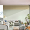

Cotton by Missana Reception Furniture

On the left, Structend by Cláudio Cigarro. On the right E15 installation

Day Pouf By Steiner


